


Hello World! Welcome to yet another article by me. In today's article we'll be looking forward to demystify and understand the mostly used relative units in CSS. Hope that you like it and find it helpful.
To stay notified about all my upcoming articles make sure that you subscribe to my newsletter.
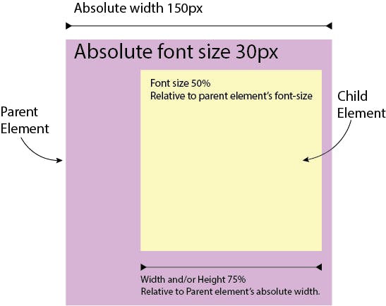
Percentage Unit.
Conclusion:
- In case of fonts the percentage units are relative to the parents absolute(computed to be precise) font-size.
- In case of lengths(i.e. padding, margin, width, height, etc) the percentage units are relative to the parents absolute(computed) width.
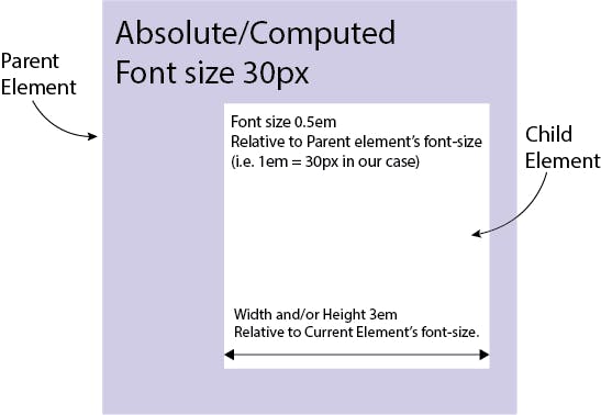
Em Unit.
Conclusion:
- In case of fonts the em units are relative to the
parents computed font-sizefor a given child element. - In case of lengths(i.e. padding, margin, width, height, etc) the em units are relative to the
current(the element in which they are declared) element's computed font-size.
- In case of fonts the em units are relative to the
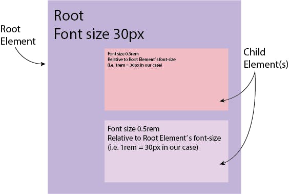
Rem Unit.
Conclusion:
- In case of fonts the rem units are relative to the
root element's computed font-sizefor all the child elements within it. - The above case applies for lengths too.
Root element is the one which is at the top position in your webpage element hierarchy. In HTML, the root element is the
<html>element.
- In case of fonts the rem units are relative to the
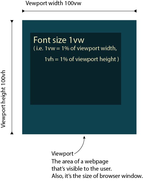
Viewport Units.
Conclusion:
- In case of fonts or lengths the viewport units are relative to the viewports width or height.
Note:
- Each unit has an initial value, used if nothing is declared explicitly.
- The Browser specifies a root font-size for each page by default.
- Relative units are always converted to pixels by the browser.
Other articles I'll recommend you to read:
Make sure to share this if you found it helpful, and keep learning, you're a genius.