Multiple Transformations On Single Hover Using CSS

Hello world Hope you are doing just fine :) Welcome to yet another Article by me on CSS where we talk about multiple transformations on single hover using Pure CSS 👇
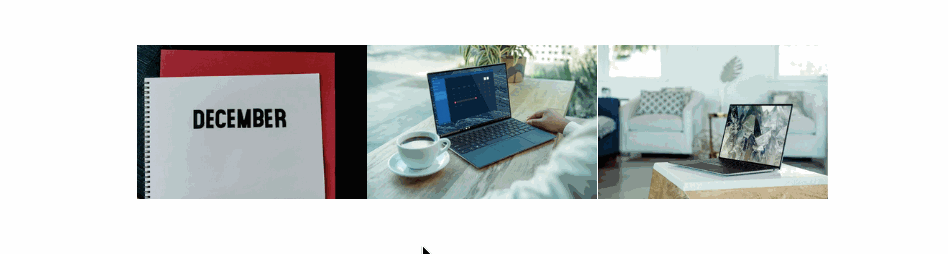
It's noticeable in the above GIF that when we hover over one image, the one that has been hovered scales up while rest of the images scale down, thus the title.
You should give this article a read if:
If you have encountered CSS recently and have started building off with it or have started learning CSS, this article has found you.
Anyways if you are plain curious and want to how you can implement something as shown above using CSS in your next project stick till the end.
Let’s define the thought process first before digging into the code:
As someone said “When what is clear, how is near”
What we are looking forward to attain is to apply different transform property to one “set” of elements and another for the one hovered.
We scale the hovered item up and scale down rest of the elements.
Also if seen carefully you may notice that the process takes into account when we hover over the area that contains elements of our interest, along with the item hovered within the container.
How to (re)create it?
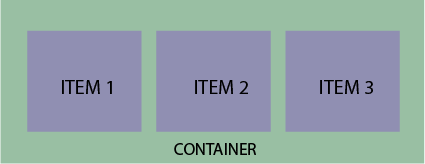
- Put all the child elements over which we want our effect to span, into a parent element(i.e. a container). 👇
We scale up the item which has been hovered using the
:hoverpseudo class along with transform property..container img:hover { transform: scale(1.1); }- We scale down the rest of the items in the container, by using the
:hoverpseudo class on the container and:not(:hover)nested pseudo class on the items inside the container.
I suggest you to remove the
:hoverpseudo class on the container and see what happens, in case you're curious/wondering at this point.
.container:hover img:not(:hover) {

            transform: scale(.8);

        }
Please note: While I have made use of the CSS grid to lay things out(because it’s too easy and can’t resist that feeling), the effect could be reproduced seamlessly using the Box-Model or CSS Flexbox.
Brief about the :not() pseudo class:
The :not() pseudo class is also called as the negation pseudo class and it represents elements that do not match a selector.
In our case it selects all the elements in the container that have not been hovered.
Read More About It Here.
Code:
<head>
    <style>
        *,
        *::after,
        *::before {
            padding: 0;
            margin: 0;
            box-sizing: border-box;
        }

        body {
            height: 100vh;
            display: grid;
            align-content: center;
        }

        .container {
            display: grid;
            grid-template-areas: ". . image1 image2 image3 . .";
            align-content: center;
        }

        img {
            width: 100%;
            transition: all .2s;
            transform: scale(1);
        }

        .img--1 {
            grid-area: image1;
        }

        .img--2 {
            grid-area: image2;
        }

        .img--3 {
            grid-area: image3;
        }

        .container:hover img:not(:hover) {
            transform: scale(.8);
        }

        .container img:hover {
            transform: scale(1.2);
        }
    </style>
</head>

<body>

    <div class="container">
        <!-- The main container -->

     <img class="img img--1" src="image-path" alt="First One">

     <img class="img img--2" src="image-path" alt="Second One">

     <img class="img img--3" src="image-path" alt="Third One">

    </div>

</body>
Other articles of mine that I'll recommend you to read:
Make sure to share this article if you found it helpful, and keep learning, you're a genius.

